Design Case Study: Enabling Users to Invest Smarter with Pluang Academy
A. Let's Start with The Why?
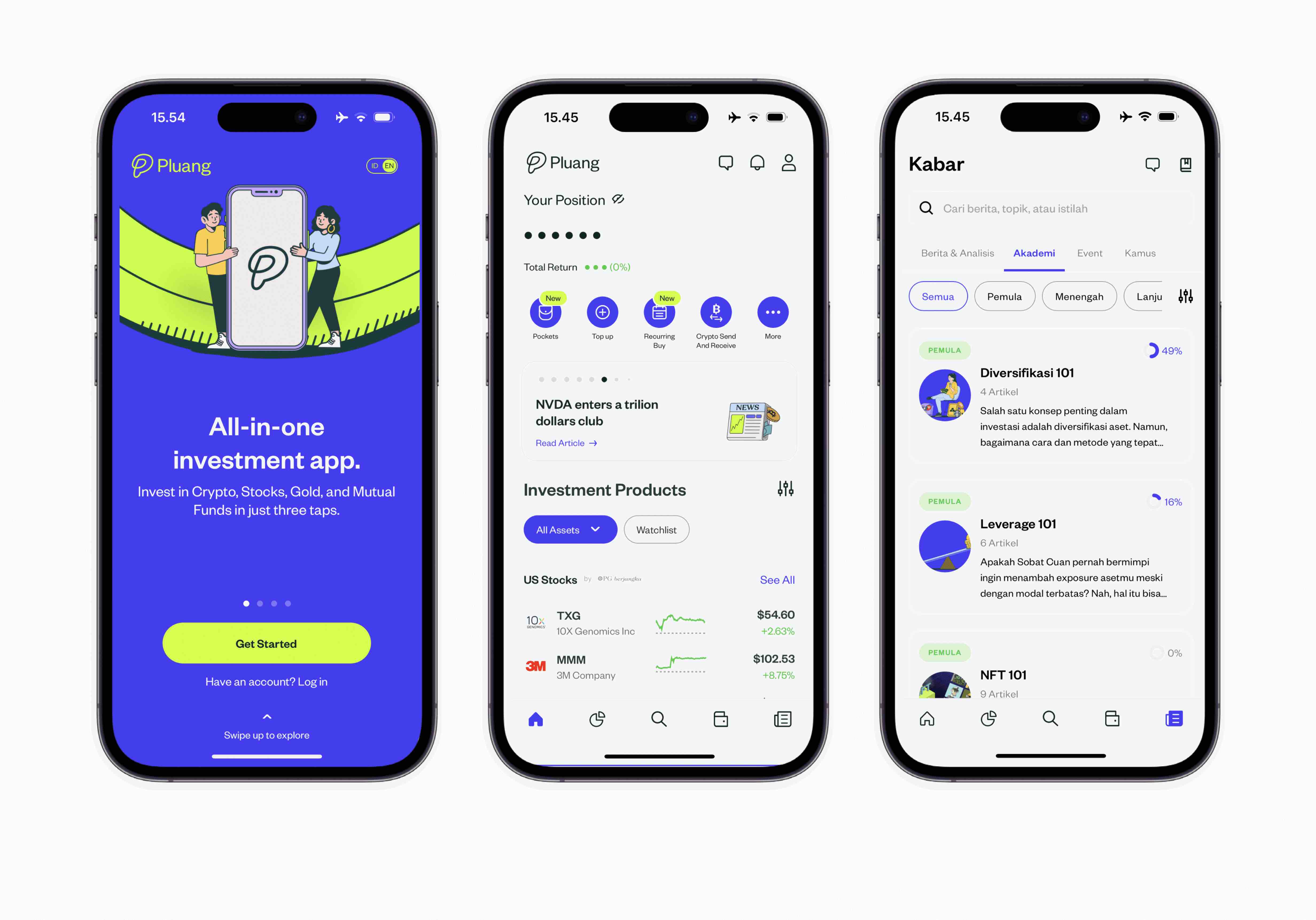
When I joined Pluang, one of my responsibilities was to create the design for Pluang's Academy feature in the mobile application. Now, as how I wrote in my other design crafts, the question is why does having this academy-kind-of feature matters?
One of the main reason is that investing can be both complex with intimidating process and steep learning curve for many people who are new to the investment world. Therefore, this may overwhelm some people to manage their expectations when investing their money due to lack of knowledge that could led to costly mistakes
Hence, having a feature that helps inexperienced investors to improve their financial literacy by learning investment strategies and risk management will further narrowing the knowledge gap, and helping them to create better decision and promote financial literacy for wider audience as well
However, since this is a create-from-scratch kind of project, the first step that I did to ensure that the product provides tangible values for our users is to benchmark the learning pattern in other investment platform's academy. What do I mean by learning pattern and moreover, why this process matters?
Learning pattern is related to user's learning journey in other investing platform. To give you readers an example, is it a video on-demand, webinar, or quizzes type of learning?. Each type has it's own gamification experience to evoke enthusiasm from learners to keep learning and educating others as well
Moreover, this information also helps me to identify which pattern is the most common and understand why, also which one is the most feasible for our content team to produce
B. Design Process
During this process, the first crucial step is to clarify and understand the goal of having the Academy feature from both business and user perspectives, so that the product provides real tangible values for both, as previously mentioned
Moreover, since I already explained the goal for the users part, it's time to identify the business part, which is what I did with the Product Manager Lead as my thinking partner. Thus, here are the business goals by having the academy feature, namely:
1. Building trust with users → Through Academy, Pluang is aiming to demonstrate its commitment to providing value beyond just a basic investment platform → This can help attract wider audience to learn and invest in Pluang's ecosystem (increase in numbers of active users and new users onboarding)
2. Increase engagement & retention → Through Academy, Pluang is also aiming to help more users to learn more about investing, which could led users to feel more empowered and knowledgeable about their finances. Hence, it drives engagement and retention from the users, which is essential for investment platforms
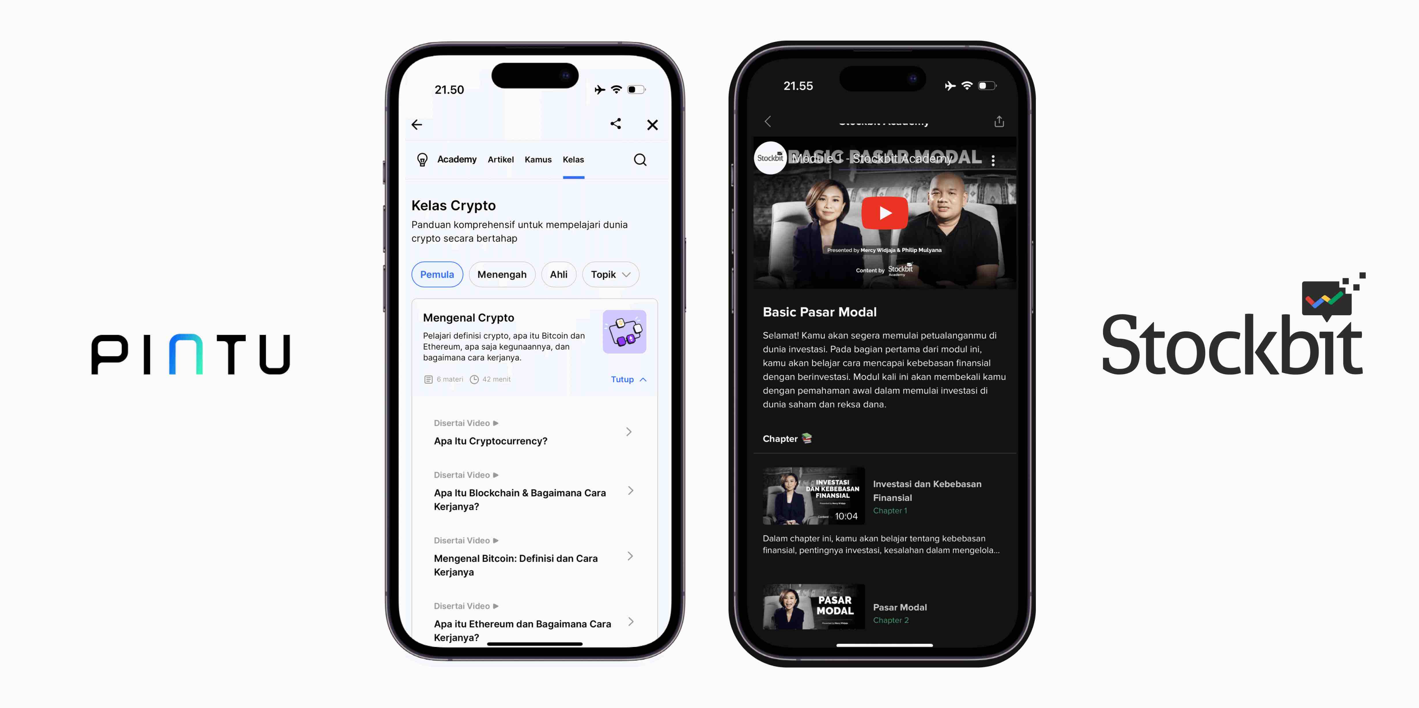 Next Step: Benchmarking from other investing platform's academy
Therefore, now that we've identified the goals from both sides, next thing that I did was to benchmark other investing platforms to identify couple of information that can be used as building blocks in building Pluang's Academy feature, such as:
1. What types of content provided by other investing platforms? → As an example, written or article modules, online events or on-demand recorded lessons
2. How does other platforms attract user's attention and keep the enthusiasm to learn? → Some examples, including convertible points (points that can be converted into assets for cash out), increase referral invitation, or maybe redeemable points to access premium features?
3. How easy it is for users to access the academy? → As an example, does the users need to login or also accessible with guest mode? or perhaps, is the feature accessible directly from the homepage or there are couple of layers to access the menu?. Thus, here are my benchmark results:
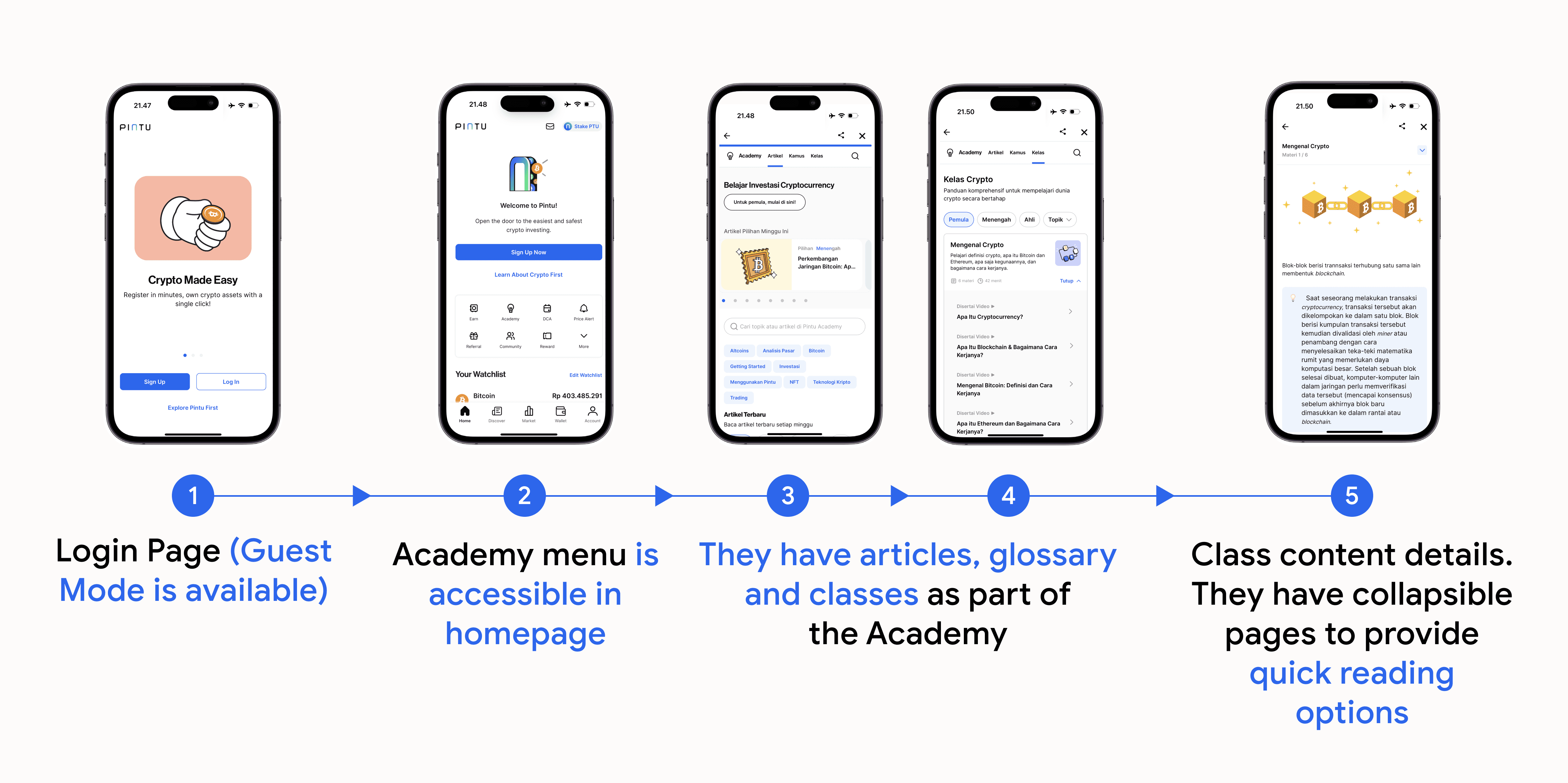 A. User Journey in Accessing Pintu's Academy
Wins → Pintu offers guest mode experience for new users to explore and their academy menu is directly accessible from the homepage. Moreover, in terms of the content type itself, Pintu provides an article or blog-based content with collapsible sections for quick reading options and material highlight from the class list page (Point 4)
Gaps → When accessing Pintu's academy, the class section hierarchy is positioned in far right which indicates lesser priority. As an academy, this is something that should be prominent. Moreover, there's no learning progress indicator that can motivates users to return and learn in the future
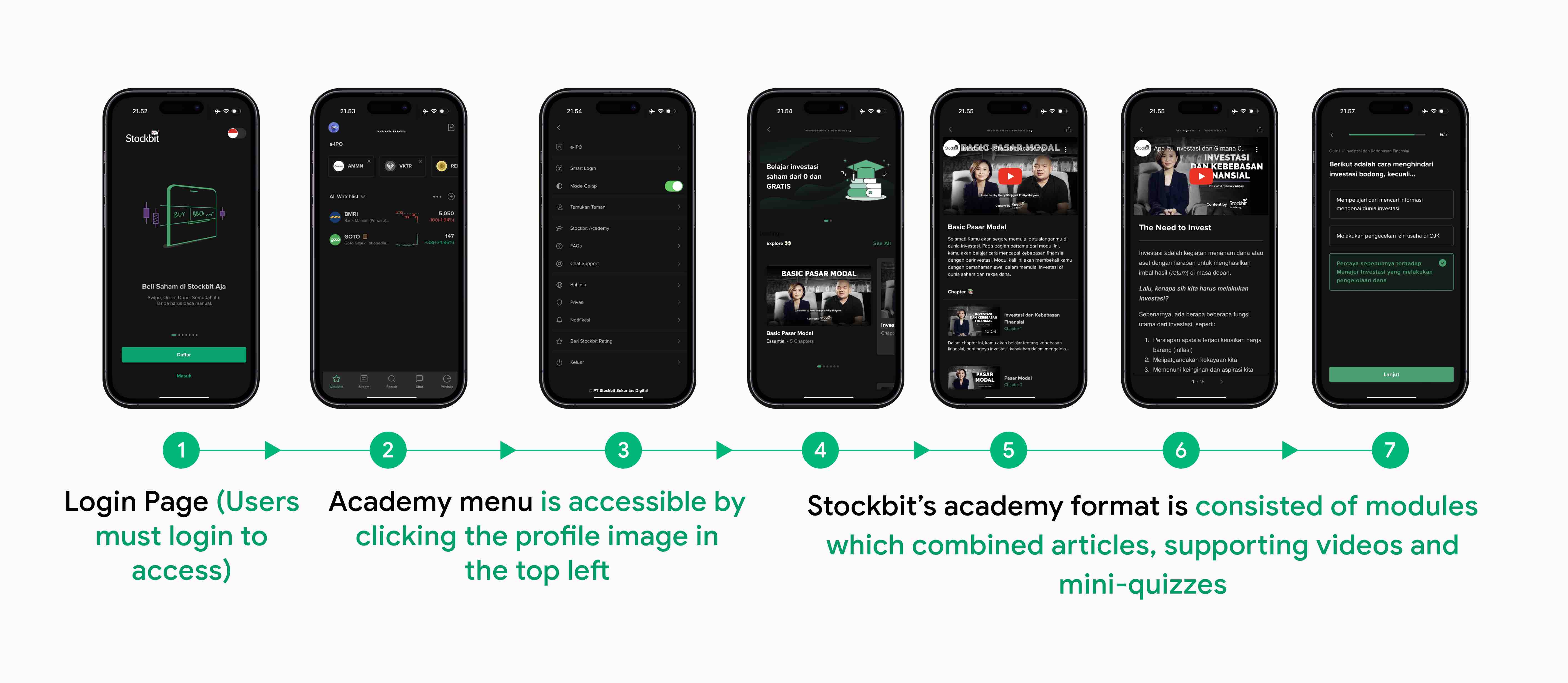 B. User Journey in Accessing Stockbit's Academy
Wins → Stockbit's strongest part lies in it's academy module which consisted of video, article and mini-quizzes once users have finished reading the article to strengthen user's understanding. This is similar to Udacity or Udemy's interactive learning experience
Gaps → There are couple of steep process to access Stockbit's academy for new users, such as mandatory to login or register, and the need to click on user's profile picture to access the Academy feature. Moreover, once users are in the academy's homepage, there are no visible options to choose content level categories in the academy's homepage (users are required to click See All option to be able to choose the level) and the level naming sounds unfamiliar (i.e All, Essential, Sector) without any helper text to describe the context, especially for new users
Therefore, based on the benchmark result, there are several opportunities or possible wins that Pluang's academy can approach, namely:
1. Academy should be accessible with guest mode experience. Why? → To provide users streamlined and frictionless learning experience which could increase user engagement and the likelihood that users will return to the app in the future
2. Academy should be prominently accessible from the homepage. Why? → To ensure that users have easy access to educational resources and engage with the content and learn about financial concepts, products, and services that are relevant to them. This can ultimately lead to greater financial literacy and confidence in their financial decision-making. At the same time, build trust and loyalty between both the platform and users
3. Academy should have a prominent learning progress indicator as well. Why? → By having a learning progress indicator, users can easily see how far they've come in their financial journey, which can encourage them to continue learning and making progress. This can lead to higher engagement and ultimately, advocating others to learn about investment, the right way
C. Design Preview
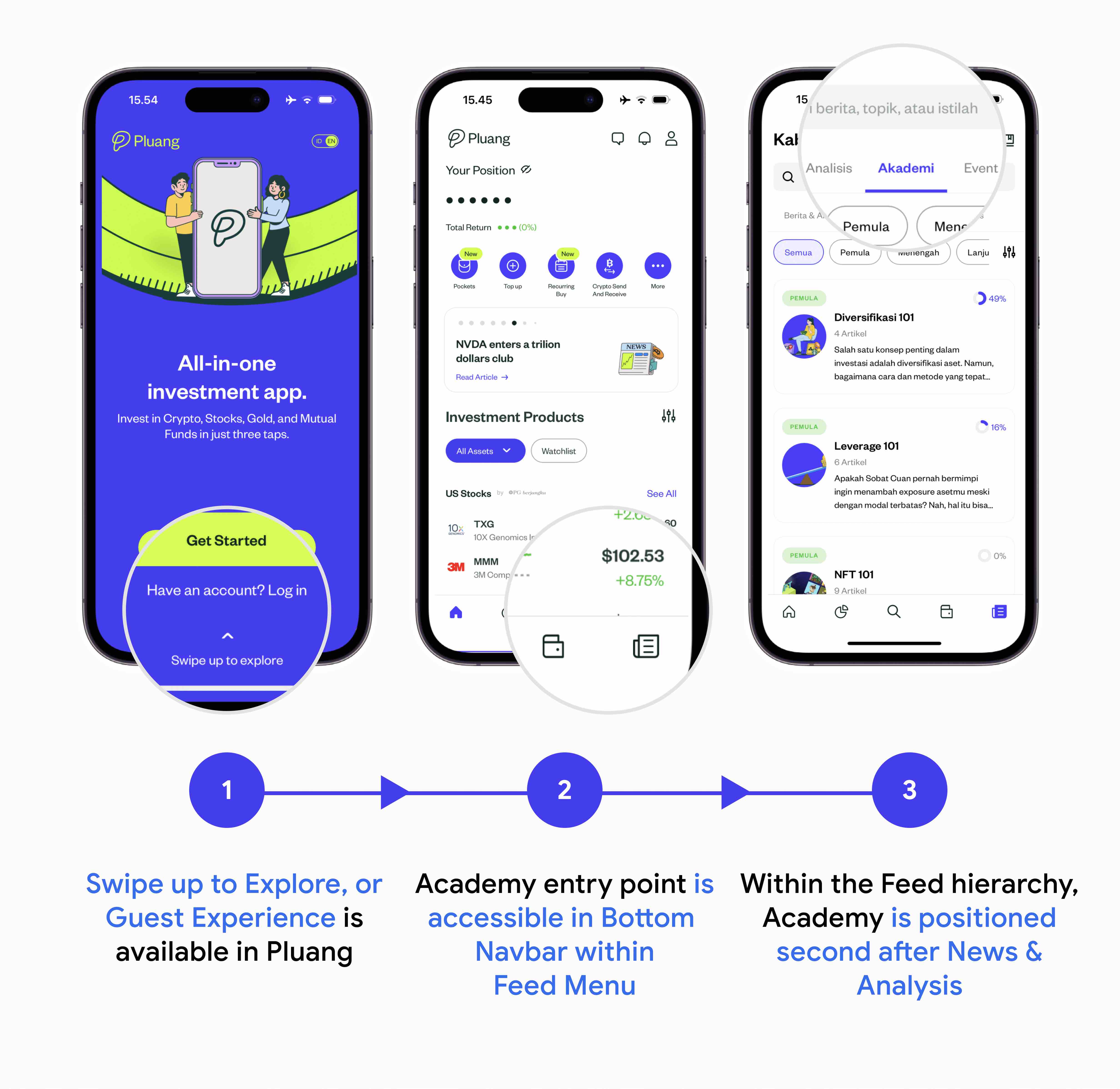 1. Guest Mode Experience to Access Pluang Academy
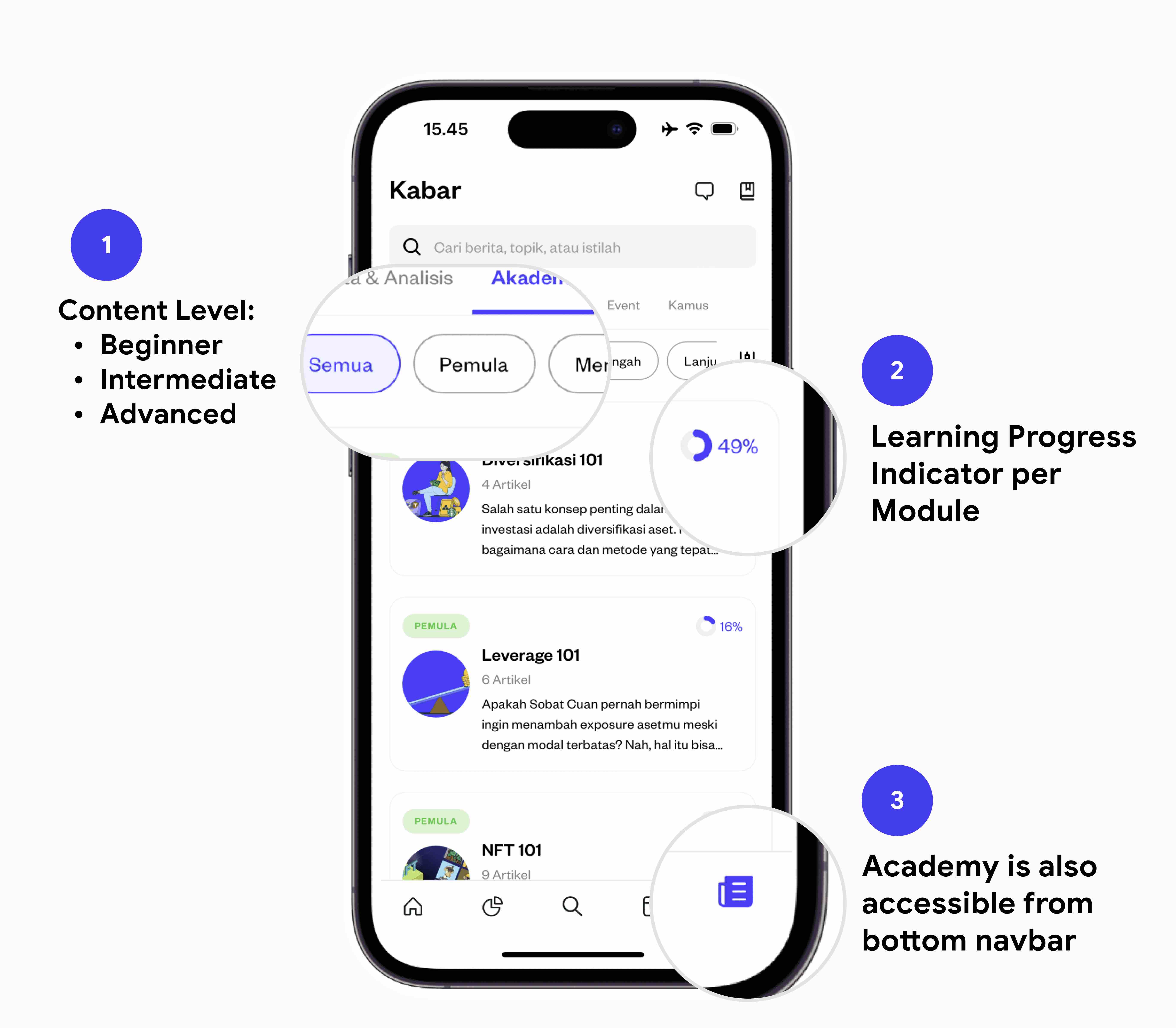 2. Academy Homepage
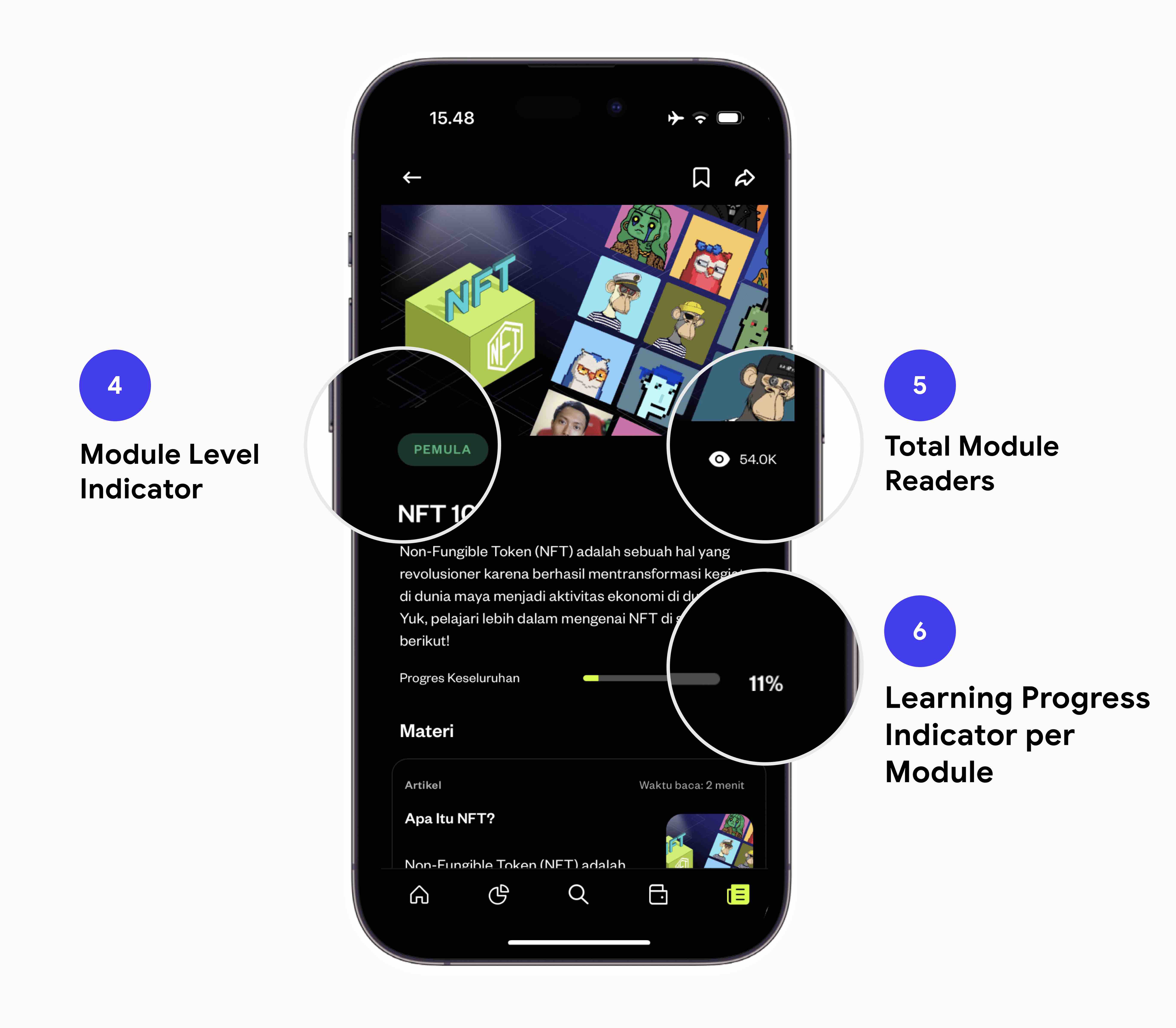 3. Module Page
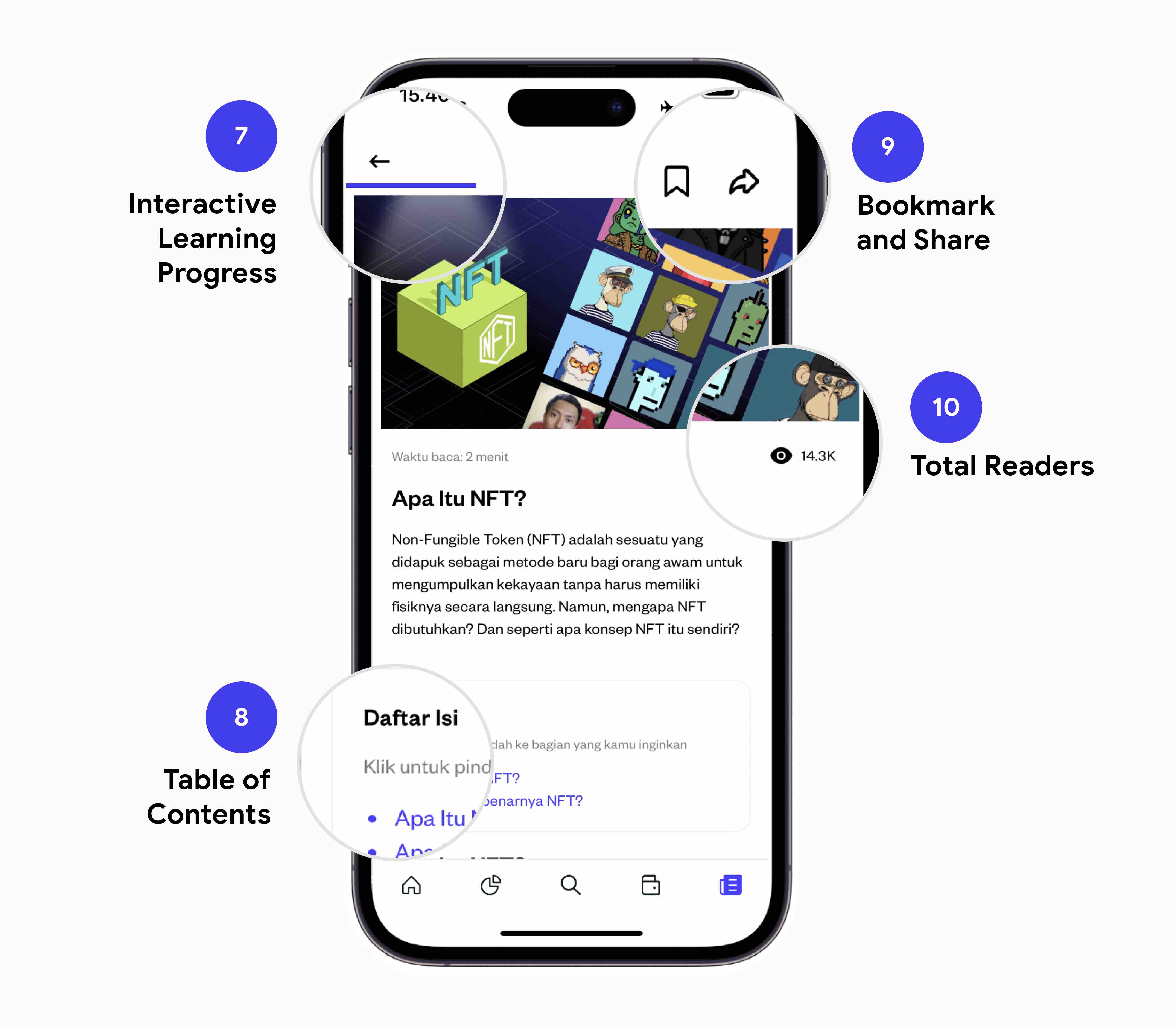 4. Content Detail Page
D. Learnings
In general, when it comes to digital investment platforms or fintech applications like Pluang, Stockbit and others, having a centralized learning resources play a crucial role in improving the financial well-being of users by addressing complex topics which could narrow the knowledge gap and make investing more accessible to wider users. Thank you for reading!
