Design Case Study: Enabling Users to Learn Bobobox's Product Values Better
A. Let's Start with The Why?
When I joined Bobobox as a Product Designer, one of my responsibilities was to improve the customer facing experience for web applications. Thus, this story will be focusing on the process. However, before going deeper, I believe it's pivotal to first understand why the improvement matters in the first place?
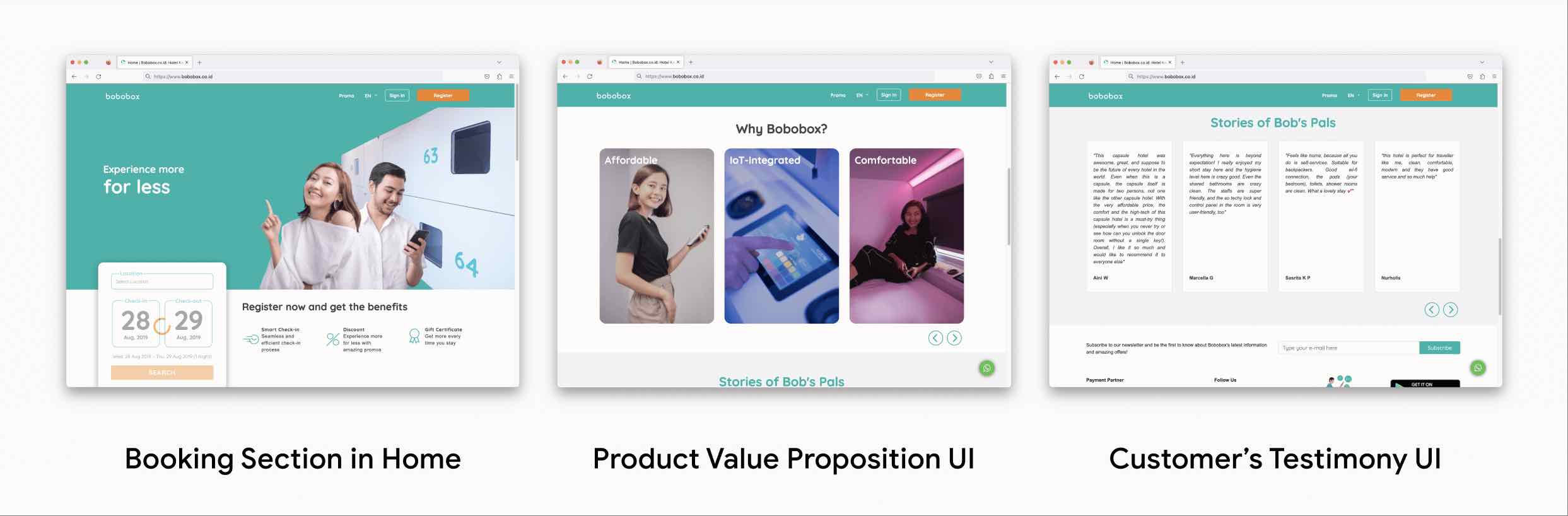 Bobobox's Old Website Interface
To answer the question, I took my time by collecting relevant information to Product Manager with one simple but critical follow-up question: What's the purpose of the website?. Now, why asking such question?
Asking such question is critical because it helps me to identify the gap between product vision from the stakeholders, business goals and the execution output. What do I mean by the gap?. In the simplest form of explanation for all readers: Does the output or result reflect the vision and align with the business goals?. Therefore, here are the relevant and supporting information that I've collected about the website's purposes:
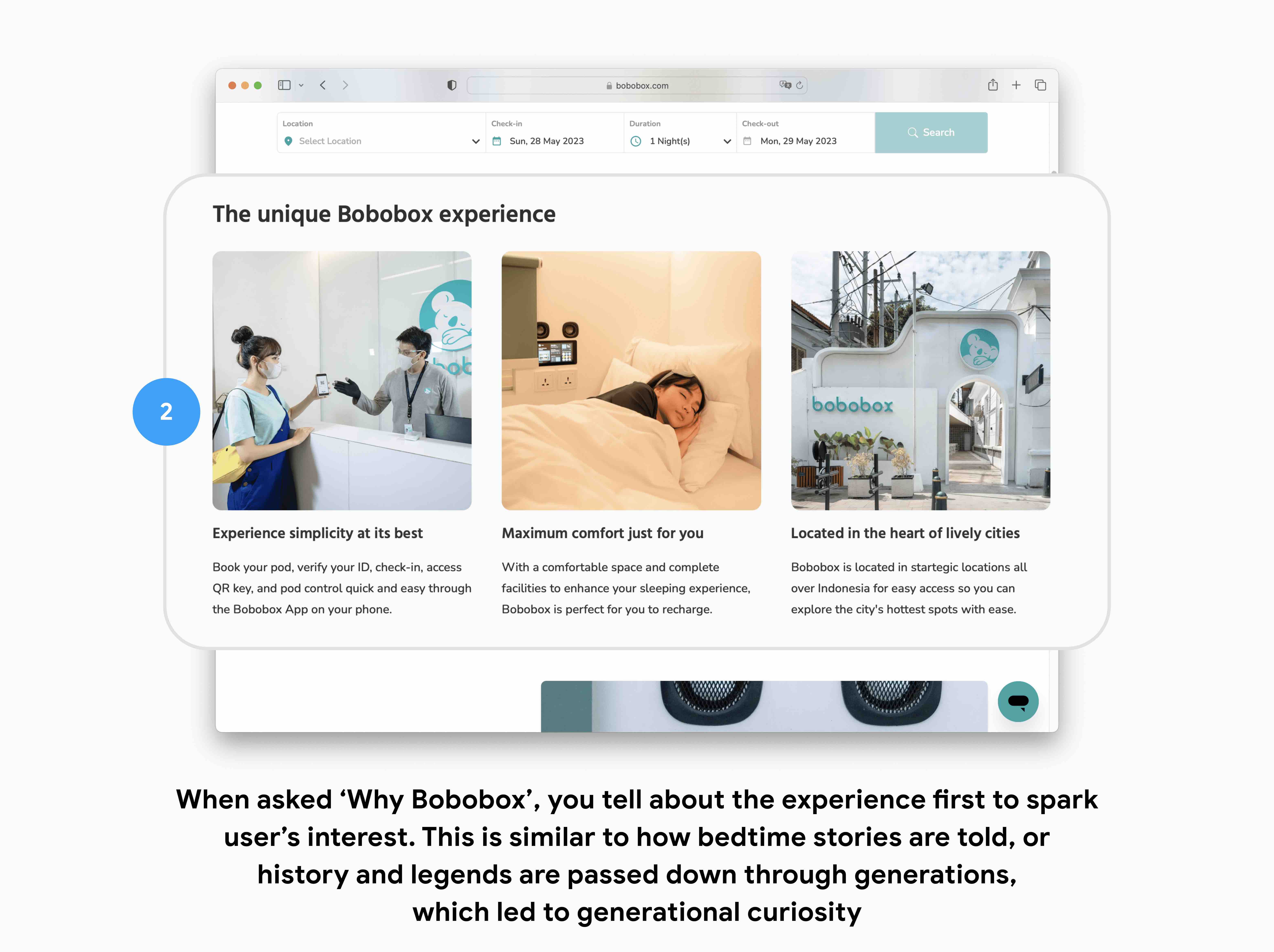
1. Broaden and strengthen user awareness to Bobobox's product and service value → Bobobox was launched in 2017. Thus, at the time of me joining the startup, it was operating under three years old, which is fairly new. So, it is important to have a platform which served as an awareness touchpoint (What is Bobobox and Why Sleep with Bobobox) to convince users to register or download the app
2. Increase Number of Successful Booking via Bobobox mobile app → Similar to other booking digital products: Mobility and convenience become two key principles in desinging it's experience. Why? because the target users for most of these apps are travellers. Hence, that's why having a mobile version is important. But, for a less-than-three years old startup, there has to be a clear funnel to convince users to download and book from the app
3. Accomodate seamless experience with web-based booking → Web based booking allows Bobobox to offer seamless and convenient experience for users without forcing first-time users to install. But, why?. There are couple of reasons. First, users may have limited space on their devices and may not want to download an app for a one-time use. Moreover, users may be concerned about the safety and security of their personal information on a new app. Lastly, some users may simply prefer to use a web-based platform as it's more accessible and doesn't require additional downloads or updates. Therefore, as an affordable accommodation service provider, having flexible booking options would be beneficial for both users and the business through product inclusion
Therefore, now that we know the website purposes. It's time to evaluate the output result based on the collected user feedbacks to identify action items regarding what features to add or improve
1. The old web interface doesn't provide enough information about 'What is Bobobox?' and 'Why Bobobox?' → Impact: Low Booking and Mobile App Download Click Through Rate (CTR). In other words, users are not convinced to book and stay with Bobobox. At that time, what users know about Bobobox is limited to only capsule hotel service. Hence, most users prefer other services such as RedDoorz and OYO since their rooms are much spacier at similar price range with Bobobox → Improve the information architecture of Bobobox's website
2. The old web interface isn't mobile friendly and took time to load → Similar to the first point, users are met with difficulties to really understand 'Why Bobobox' (added with load-time performance and accessibility issue), beside 'another capsule hotel' service. Hence, users prefer to use services such as RedDoorz & OYO → Add mobile web version
B. Design Process
 1. Improve Bobobox's Website Infomation Architecture
Although information architecture sounds sophisticated, it's true meaning is quite straightforward: How to present a glossary of information that is intuitive, easy to understand and navigate. The goal is to help users (or should I say, guest?) to find what they are looking for, quickly and efficiently, while also ensuring that the information they find is relevant to their needs. Therefore, by that definition, the underlying question now is: What kind of information that users really need to know?
To answer the question, my next step is to identify the most relevant user needs that we should prioritize to solve based on the most concering issues raised by stakeholders and user feedbacks. In this case, the business goal is to increase the number of successful booking rate, while at the same time, users are met with difficulties in understanding Bobobox's product and service which became the main blocker to achieve the business goal. Thus, from this analysis, I was able to identify that the most relevant user needs to solve is What kind of information that users really need to know to increase the successful number of booking?
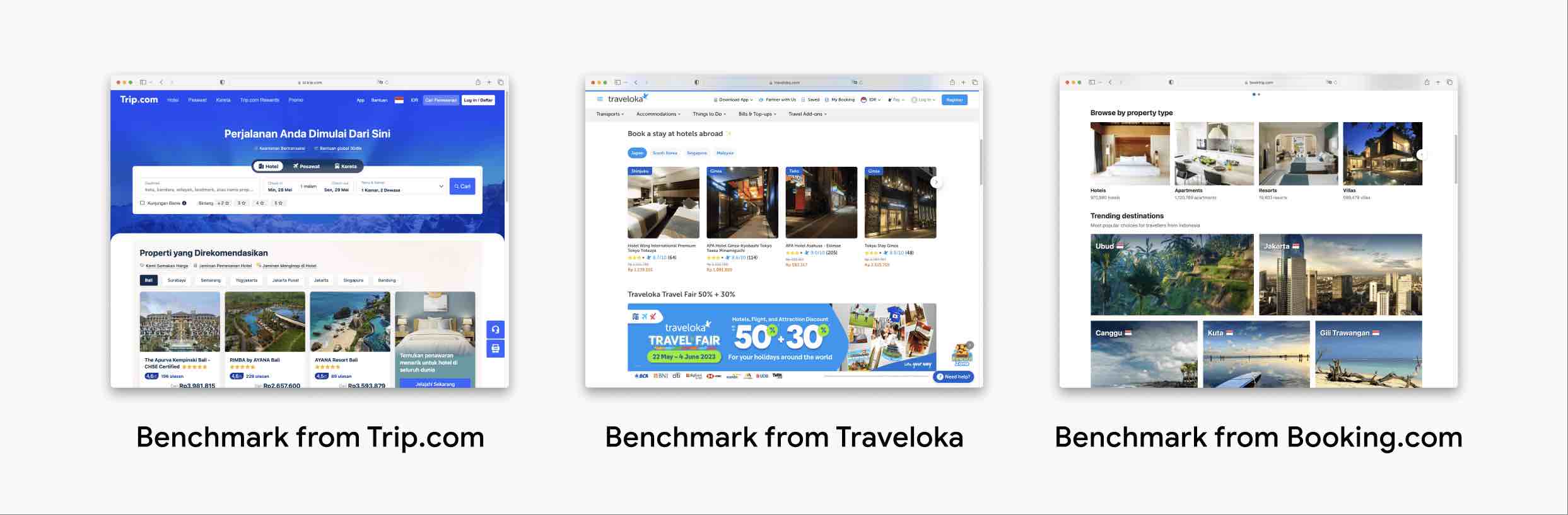
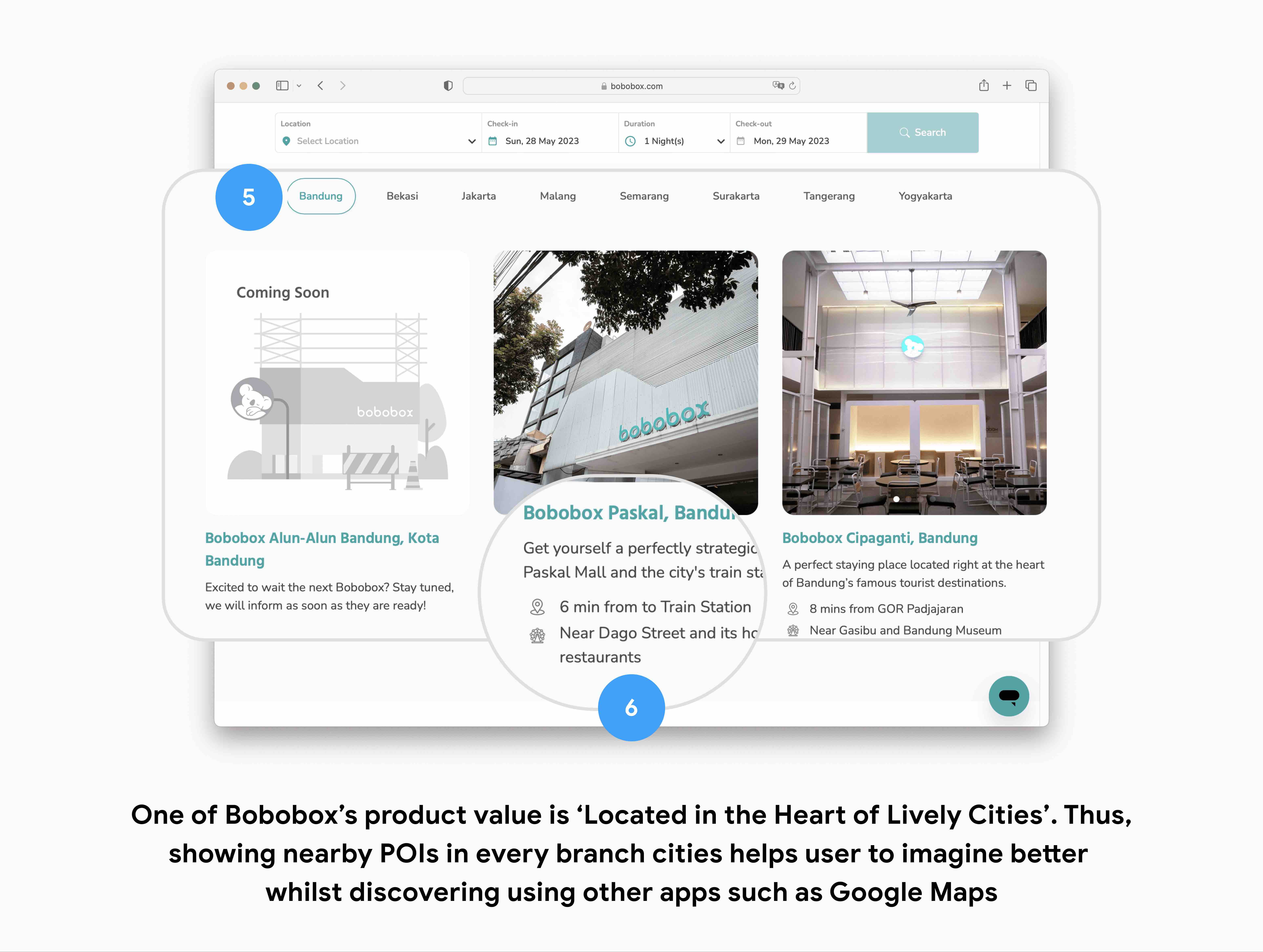
1. Location: Based on the benchmark that I did with other booking platforms such as Traveloka, Trip and Booking.com, the first and foremost information that they emphasize is location. Why? well, as a guest, knowing the location will help them determine if the hotel is in a convenient location for their needs. Furthermore, this information could help strengthen Bobobox's product and service awareness since one of Bobobox's product value is literally Located in the heart of lively cities where all of Bobobox's branch are located in startegic areas all over Indonesia for easy access so guests can explore the city's hottest spots with ease
2. Price: For a capsule hotel case such as Bobobox, room price is particularly important because guests are essentially paying for a small sleeping pod rather than a traditional hotel room. By knowing the room price, guests can decide whether or not the price of the pod is worth it for the amenities and location that Bobobox offers.
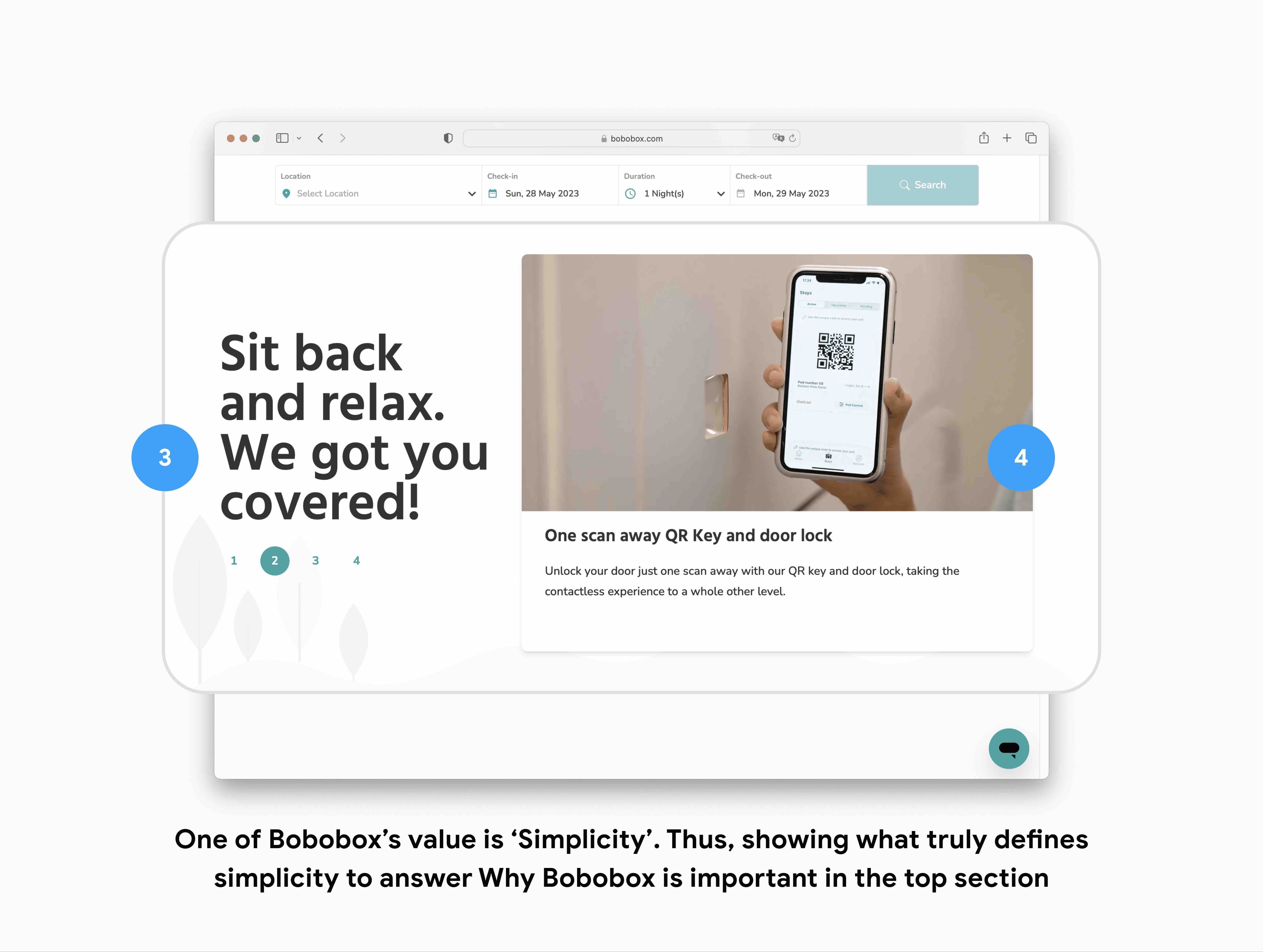
3. Facilities and Services: One of Bobobox's product value is Maximum comfort. Thus, having Facilities and Services information are crucial for guests to gives them a clear idea of what to expect during their stay. For example, knowing that Bobobox provides 24-hour reception, free Wi-Fi, and a communal lounge area can make a big difference in a guest's decision to book a stay. Moreover, facilities and services information can also help users to plan their trip better. For instance, if a user knows that Bobobox provides a laundry service, they may choose to pack less clothing, which can make their travel experience more comfortable.
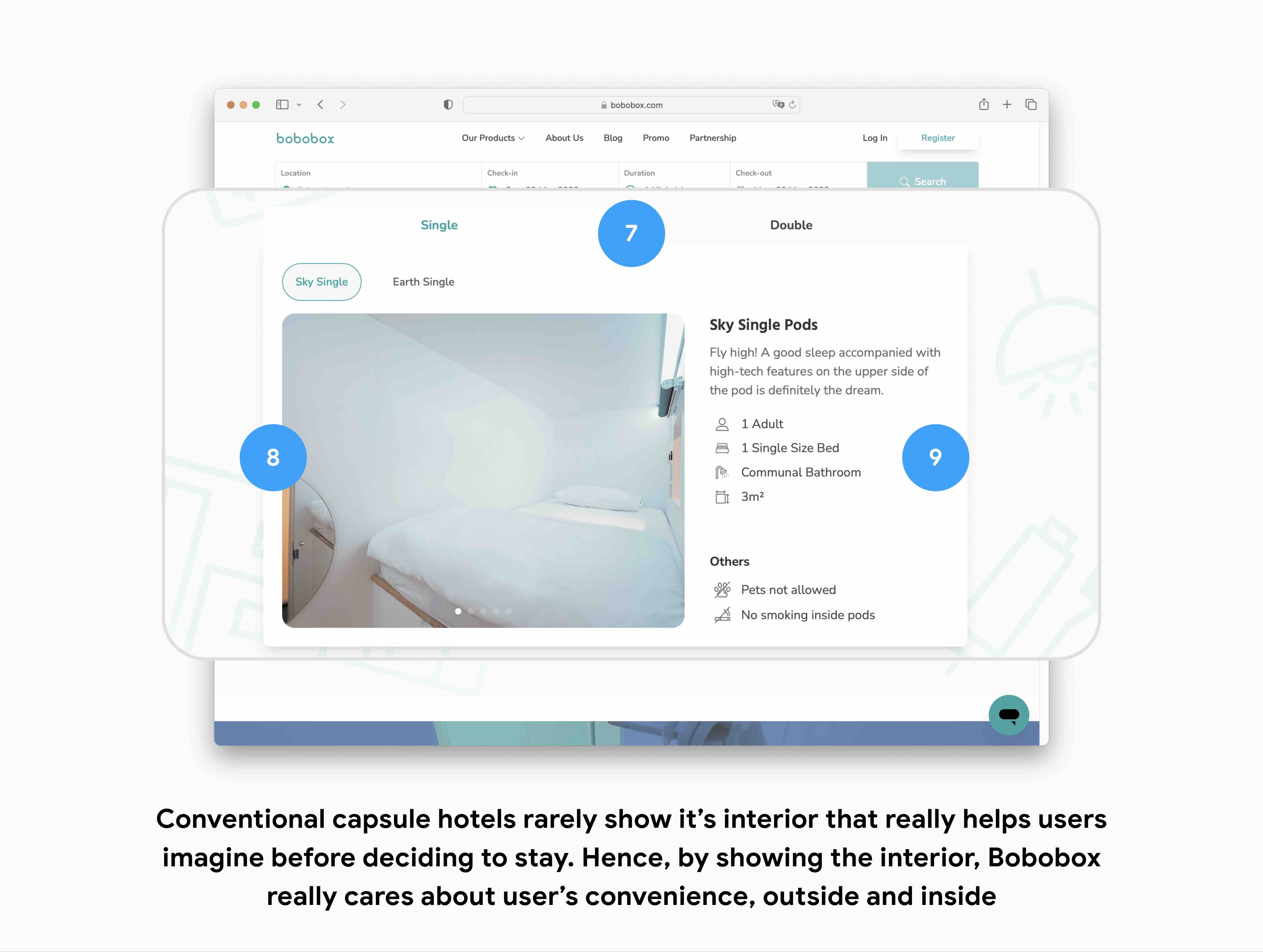
4. Room Types: Room types are an essential piece of information for guests when booking any hotel. In the case of Bobobox, the room types give guests an idea of the size and layout of the capsule they'll be staying in
5. Nearby POIs: This information is also essential to help guests to understand the surrounding area and what activities they can do during their stay. For example, guests can check out popular restaurants, tourist attractions, shopping centers, and other places of interest that are within walking distance or a short drive away. Moreover, Nearby POIs can be very helpful for guests who are unfamiliar with the area and want to make the most out of their stay.
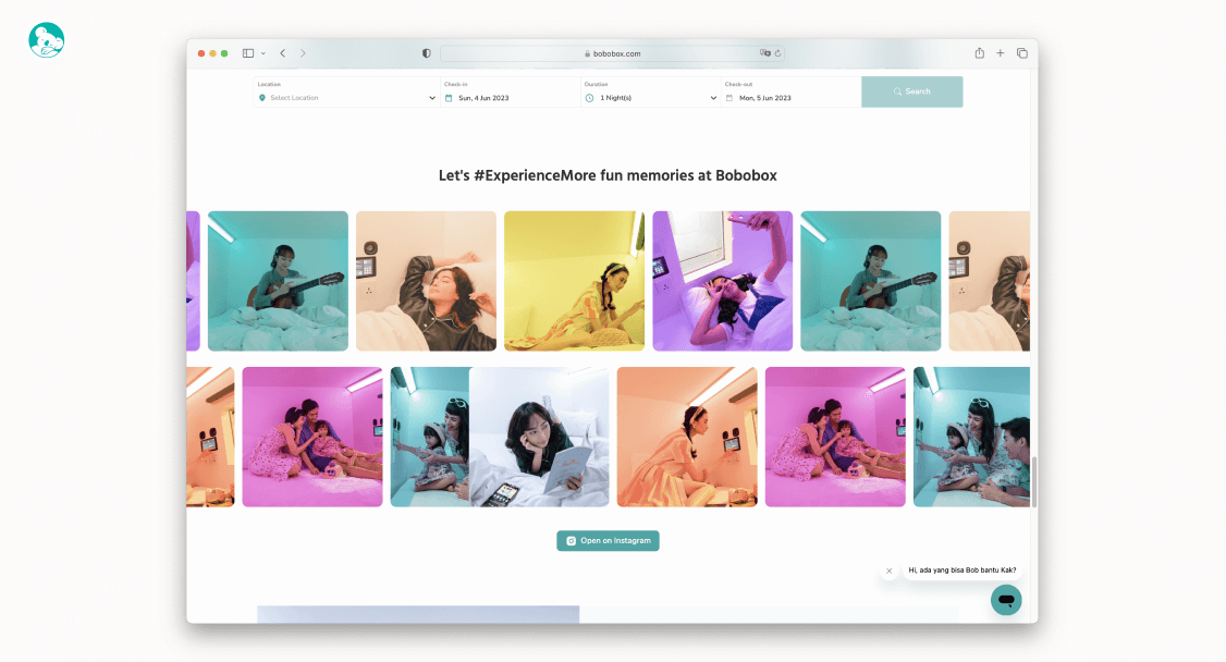
C. Design Preview 🎨
E. Learnings
In general, designing digital product for the hospitality or hotel industry is such a unique experience where you can take crucial part to really think and feel as a real world user by traveling and staying at the pod. This process, for me is enjoyable, challenging and relaxing at the same time
Moreover, it broadens my mind that to get the best sleeping experience, designers need to also pay extra attention to how to make users feel relaxed and at ease from when they step in the lobby, for the very first time. Thank you for reading!